Making AI-generated content visible across SAP.
I designed AI Notice, a pattern that tells users when content was generated by AI and nudges them to verify it, without getting in the way of their work.
The problem
In 2023, AI was being added to SAP products faster than design guidance could keep up.
AI-generated reports and text were blending in with human-written content, and users often couldn't tell the difference. That created risks for trust, misinformation and compliance. Every team was solving it differently, or not at all.
What we learned
Remote interviews and evaluative testing with 26 designers, developers and PMs across APJ, EMEA and AMER.
- Awareness of AI guidelines was moderate to low. Information was spread across wikis and newsletters, so people didn't know where to look.
- Seniors and juniors needed different depth. Senior designers wanted principles. Juniors wanted detailed specs.
- Existing AI entry points went unnoticed. 90% of participants missed the Joule button in the toolbar, a warning that an AI label could be just as invisible.
| Awareness by topic | EMEA (11) | APJ (7) | AMER (5) |
|---|---|---|---|
| Ethics | 82% | 14% | 60% |
| Responsible AI | 46% | 14% | 60% |
| Designing safe AI | 46% | 14% | 40% |
| Designing sustainable AI | 46% | 0% | 40% |
| Building trust with Gen AI | 36% | 43% | 40% |
| Designing effective prompts | 46% | 14% | 40% |
| Components | 55% | 43% | 40% |
Design strategy
- Label where it matters most: content creation, automation and decision-making, where users act on what AI produced.
- Explain on demand: a short notice by default, with more detail only when the user asks.
- Give simple control: a single toggle to show or hide AI highlights.
- Prove it before expanding: ship an MVP pattern and learn before adding complexity.
Nobody had a standard yet
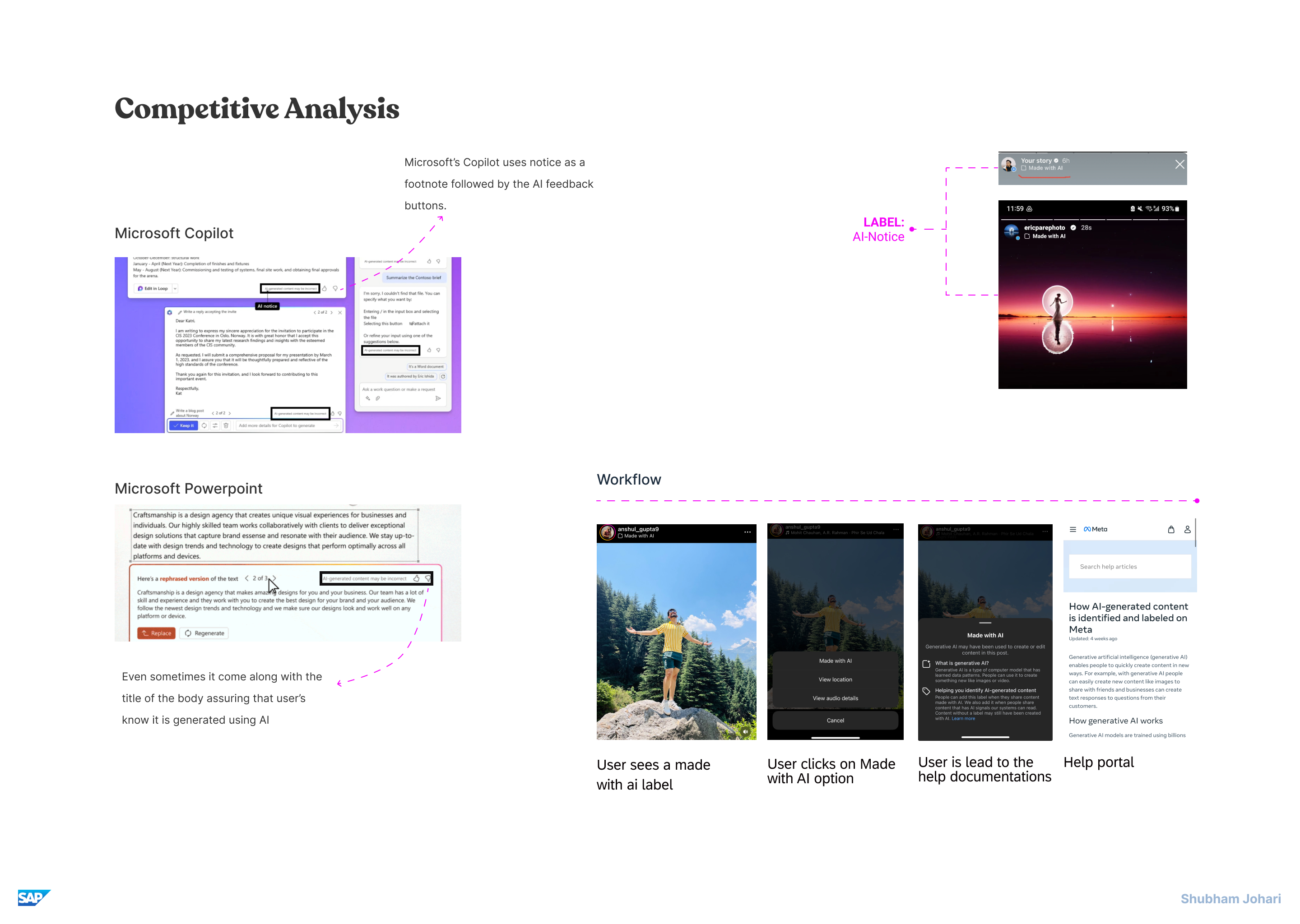
A competitive study showed every product inventing its own label. Copilot and PowerPoint tuck a notice into a footnote beside the feedback buttons. Instagram tags whole posts "Made with AI" and links to a help page. There was no shared name or placement to borrow.
What didn't work
Early concepts failed in useful ways.
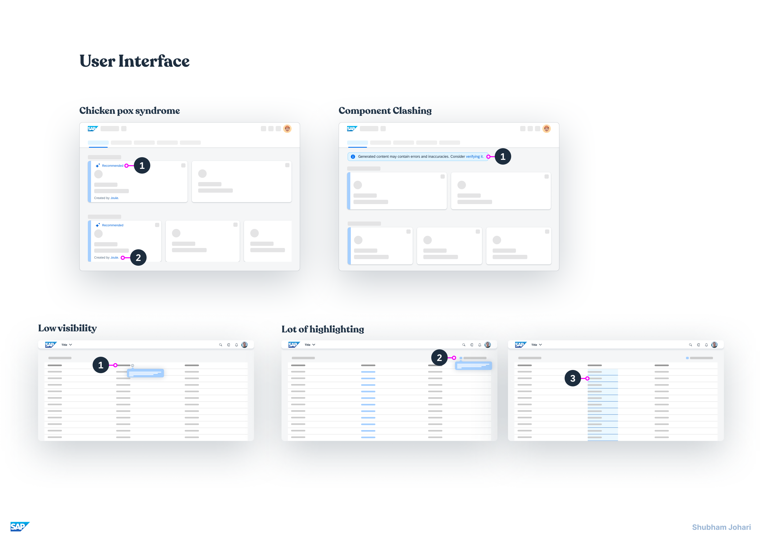
- ●"Chicken pox syndrome." Sparkle icons and tags on every AI element created noise instead of clarity.
- ●Component clash. Reusing the Fiori message strip made AI notices look like system warnings.
- ●Low visibility. A subtle legend in the table toolbar went unseen in user studies.
- ●Over-highlighting. Highlighting whole cells pulled attention away from the actual task.
The design 🏆
Some stakeholders worried that labelling AI would make people trust it less and use it less. The answer was a tiered notice: quiet by default, with detail only when someone asks for it.
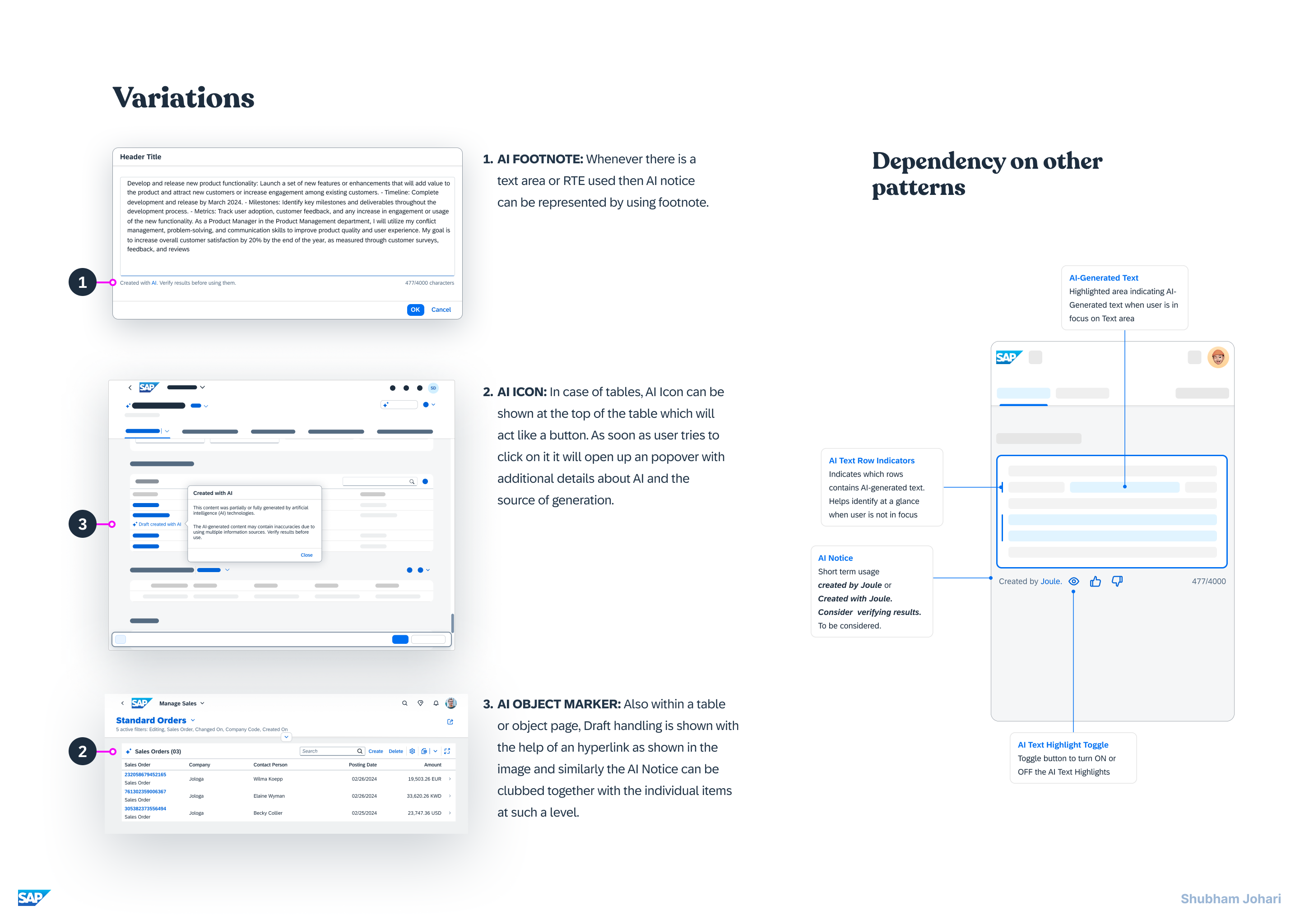
- AI footnote under any text area or rich text editor: "Created with AI. Verify results before using them."
- AI icon in table toolbars, which opens a popover explaining how the content was generated.
- AI object marker on rows in tables and object pages, grouped with the item it describes.
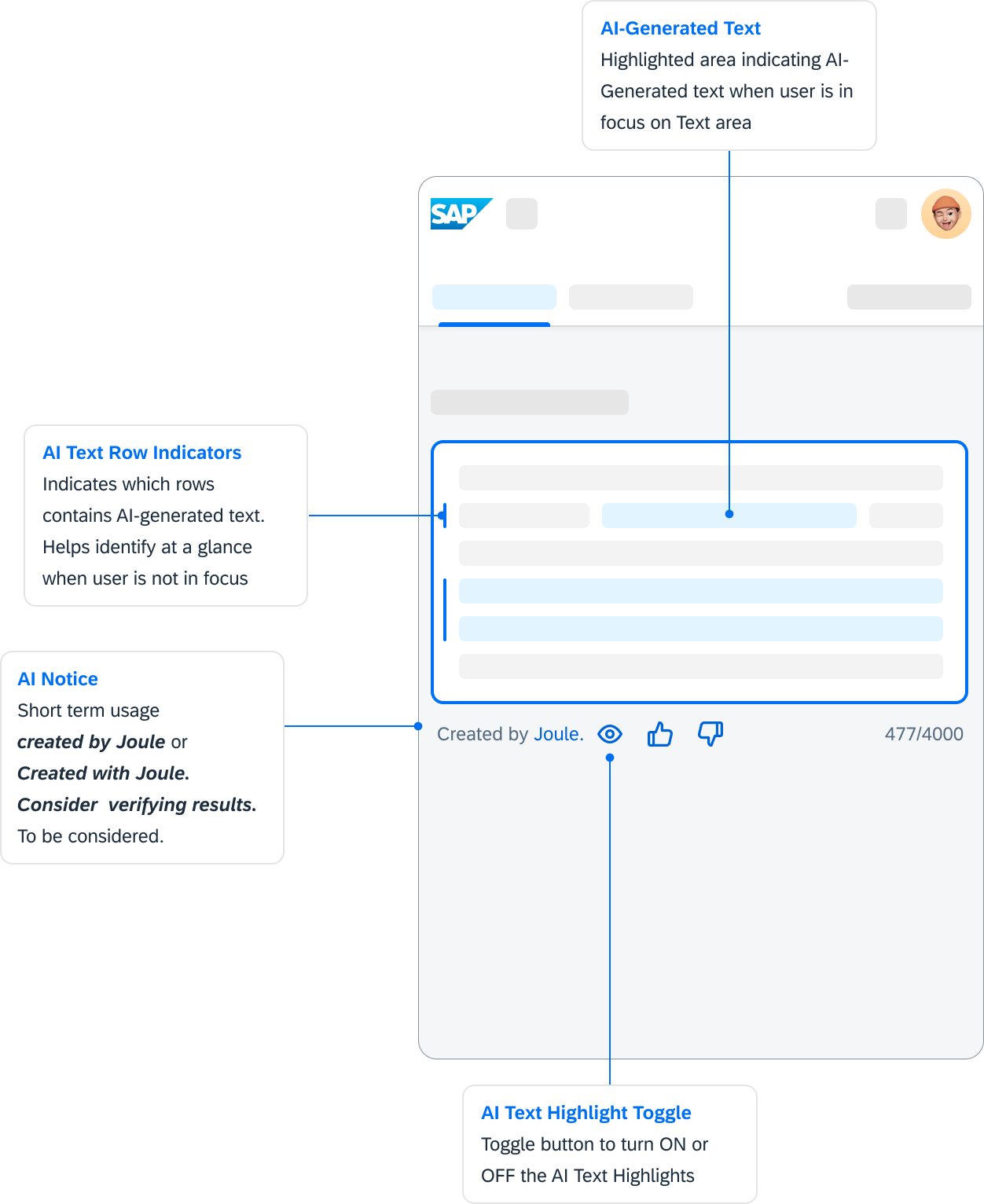
- Row indicators, text highlight and a toggle for text areas, so users can see exactly which words came from AI.
Design decisions
Why a footnote, not a banner?
A message strip looked like a system warning, and tags on every element became noise. A footnote sits where people finish reading, just before they act, and matches what users already know from tools like Copilot.
Why tiered, not fully explained?
Stakeholders worried that heavy labels would scare people off AI. A short line by default keeps work moving, while the full explanation is one click away in a popover.
Why highlight only on focus?
Highlighting whole cells pulled attention from the task. Row indicators stay quiet at rest, exact words highlight only while editing, and a toggle turns highlights off for people who don't need them.
Why build from existing Fiori parts?
Teams could adopt the pattern without waiting for new components. That reuse is what made design cycles 30% faster and kept AI features consistent across products.
Impact
The pattern became part of the SAP Fiori design guidelines, so every team building AI features inherits it.